In this post you learn CSS Repeating Background Gradients. The repeating-linear-gradient() CSS function creates an image consisting of repeating linear gradients. This data type is a special type.
Let’s dive in….
First Gradient
CSS Gradients data type. this example uses an gradients to show the repeating background gradients of steps in process.
<style>
     div#ttt{
     border-radius: 20px;
     width: 30%;
     height: 600px;
     margin: auto;
     background: repeating-linear-gradient(
     60deg,
     #DC143C 40px,
     #DC143C 40px,
     #7FFF00  70px,
     #7FFF00  70px
     );
      }
  </style>
<body>
  <div id="ttt"></div>
</body>
The above code should look like the gradient image below in your preferred browser.
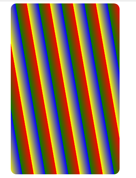
Second Gradient
In this code we will create another gradient. But with other colors.
<style>
   div#ht{
           border-radius: 20px;
           width: 30%;
           height: 600px;
           margin: auto;
           background: repeating-linear-gradient(
             80deg,
             yellow 0px,
             blue 40px,
             green 40px,
             red 80px
           );
          }
</style>
 <body>
    <div id="ht"></div>
</body>
The above code should look like the gradient image below in your preferred browser.
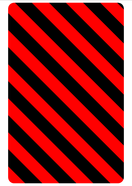
Third Gradient
In this code we will also create gradient. But with other color.
<style>
div#th{
     border-radius: 20px;
     width: 30%;
     height: 600px;
     margin:  auto;
     background: repeating-linear-gradient(
     45deg,
     red 0px,
     red 40px,
     black 40px,
     black 80px
      );
  }
</style>
<body>
 <div id="th"></div>
</body>
The above code should look like the gradient image below in your preferred browser.
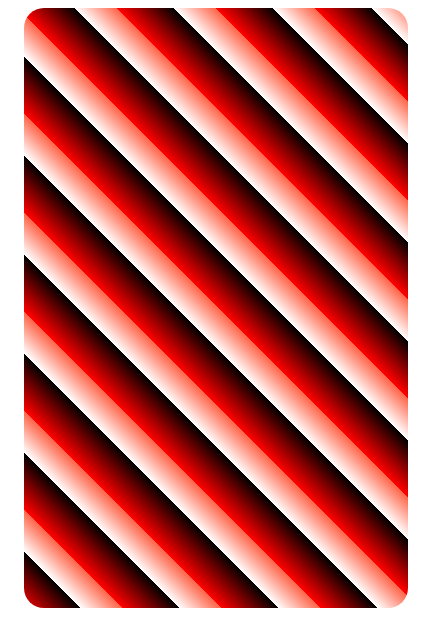
Fourth Gradient
In this code we will also create gradient. But with other color.
<style>
div#tth{
     border-radius: 20px;
     width: 30%;
     height: 600px;
     margin: auto;
     background: repeating-linear-gradient(
       45deg,
       red 0px,
       black 40px,
       white 40px,
       tomato 70px
        );
      }
</style>
<body>
 <div id="tth"></div>
</body>
The above code should look like the gradient image below in your preferred browser.
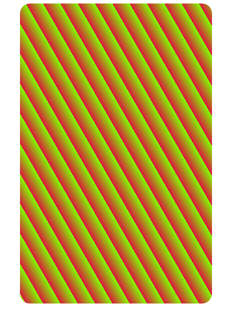
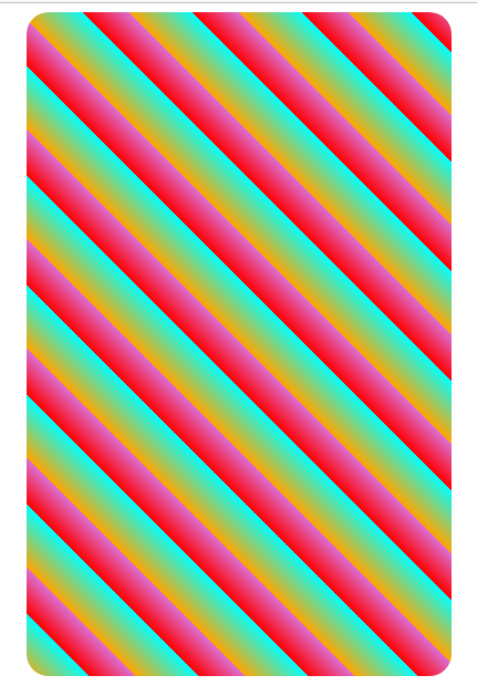
Fifth Gradient
In this code we will also create gradient. But with other color.
<style>
    div#hhh{
    border-radius: 20px;
    width: 30%;
    height: 600px;
    margin: auto;
    background: repeating-linear-gradient(
        45deg,
        orange 0px,
        cyan 40px,
        red 40px,
        orchid 70px
         );
       }
</style>
<body>
  <div id="hhh"></div>
</body>
The above code should look like the gradient image below in your preferred browser.
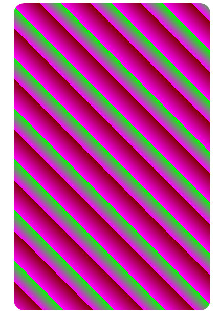
Sixth Gradient
In this code we will also create gradient. But with other color.
<style>
     div#hht{
      border-radius: 20px;
      width: 30%;
      height: 600px;
      margin: auto;
      background: repeating-linear-gradient(
           45deg,
           magenta  0px,
           maroon 40px,
           magenta 40px,
           lime 70px
           );
         }
</style>
 <body>
   <div id="hht"></div>
</body>
The above code should look like the gradient image below in your preferred browser.