In this post I going to show you how to create Ordering Flex Items. We will try it by style. we will take a look at ways in which you can change the visual order of your content when using Flexbox.
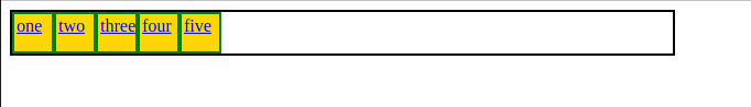
Straight the display of the items
The first two values keep the items in the same order and display the sequentially from the start line.
<!DOCTYPE html>
<html lang="en">

<head>
	<title>Web</title>

<style>
		.container {
			display: flex;
			border: 2px solid black;
			width: 600px;
			height: 38px;
			flex-direction: row;
		}

	  .item1 {
		padding: 2px;
		background-color: gold;
		width: 30px;
		height: 30px;
		border: 2px solid green;
	}

	 .item2 {
		padding: 2px;
		background-color: gold;
		width: 30px;
		height: 30px;
		border: 2px solid green;
	}
	  .item3 {
		padding: 2px;
		background-color: gold;
		width: 30px;
		height: 30px;
		border: 2px solid green;
	}

	.item4 {
		padding: 2px;
		background-color: gold;
		width: 30px;
		height: 30px;
		border: 2px solid green;
	}

	 .item5 {
		padding: 2px;
		background-color: gold;
		width: 30px;
		height: 30px;
		border: 2px solid green;
	}


	</style>

</head>
<body>

	<div class="container">
		<div class="item1">
			<a href="#">one</a>
		</div>
		<div class="item2">
			<a href="#">two</a>
		</div>
		<div class="item3">
			<a href="#">three</a>
		</div>
		<div class="item4">
			<a href="#">four</a>
		</div>
		<div class="item5">
			<a href="#">five</a>
		</div>
	</div>

</body>
</html>
The above code should look like this Image below in your preferred browser.
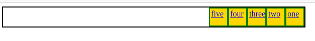
Reverse the display of the items
The second two values reverse the items by switching the start and end lines.
We can reverse the image using row-reverse in flex-direction.
<!DOCTYPE html>
<html lang="en">

<head>
	<title>Web</title>

<style>
		.container {
			display: flex;
			border: 2px solid black;
			width: 600px;
			height: 38px;
			flex-direction: row-reverse;
		}

	  .item1 {
		padding: 2px;
		background-color: gold;
		width: 30px;
		height: 30px;
		border: 2px solid green;
	}

	 .item2 {
		padding: 2px;
		background-color: gold;
		width: 30px;
		height: 30px;
		border: 2px solid green;
	}
	  .item3 {
		padding: 2px;
		background-color: gold;
		width: 30px;
		height: 30px;
		border: 2px solid green;
	}

	.item4 {
		padding: 2px;
		background-color: gold;
		width: 30px;
		height: 30px;
		border: 2px solid green;
	}

	 .item5 {
		padding: 2px;
		background-color: gold;
		width: 30px;
		height: 30px;
		border: 2px solid green;
	}


	</style>

</head>
<body>

	<div class="container">
		<div class="item1">
			<a href="#">one</a>
		</div>
		<div class="item2">
			<a href="#">two</a>
		</div>
		<div class="item3">
			<a href="#">three</a>
		</div>
		<div class="item4">
			<a href="#">four</a>
		</div>
		<div class="item5">
			<a href="#">five</a>
		</div>
	</div>

</body>
</html>
The above code should look like this Image below in your preferred browser.
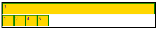
The order property
You can also use negative values with order, which can be quite useful. If you want to make one item display first, and leave the order of all other items unchanged, you can give that item an order of -1. As this is lower than 0 the item will always be displayed first.
<!DOCTYPE html>
<html lang="en">
<head>
	<title>Web</title>
<style>
		.container {
			display: flex;
			border: 3px solid black;
			width: 500px;
			height: 80px;
			flex-wrap: wrap;
		}

		 .active {
            order: -1;
            flex: 1 0 100%;
            padding: 3px;
            max-width: -webkit-fill-available;

        }


	  .item1 {
		padding: 2px;
		background-color: gold;
		width: 30px;
		height: 30px;
		border: 2px solid green;
	}

	 .item2 {
		padding: 2px;
		background-color: gold;
		width: 30px;
		height: 30px;
		border: 2px solid green;
	}
	  .active {
		padding: 2px;
		background-color: gold;
		width: 10px;
		height: 30px;
		border: 2px solid green;
	}

	.item4 {
		padding: 2px;
		background-color: gold;
		width: 30px;
		height: 30px;
		border: 2px solid green;
	}

	 .item5 {
		padding: 2px;
		background-color: gold;
		width: 30px;
		height: 30px;
		border: 2px solid green;
	}


	</style>

</head>
<body>

	<div class="container">
		<div class="item1">
			<a href="#">1</a>
		</div>
		<div class="item2">
			<a href="#">2</a>
		</div>

		 <div class="active"><a href="#">3</a></div>


		<div class="item4">
			<a href="#">4</a>
		</div>
		<div class="item5">
			<a href="#">5</a>
		</div>
	</div>

</body>
</html>
The above code should look like this Image below in your preferred browser.
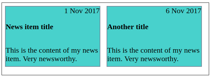
Use cases for order
The card is going to be our flex container, with flex-direction set to column. I then give the date an order of -1. This pulls it up above the heading
<!DOCTYPE html>
<html lang="en">
<head>

	<title>WEB</title>
	<style>

		 .card {
            display: flex;
            flex-direction: column;
          }

        .date {
                order: -1;
                text-align: right;
                 font-size: x-large;

            }

            p,h3 {
              font-size: x-large;
          }


         .container {
             display: -webkit-inline-box;
             border: 1px solid black;
			 width: 660px;
			 height: 230px;
         }

	    .card1 {
             background-color: mediumturquoise;
             color: black;
             height: 190px;
             width: 300px;
             margin: 10px;
             border: 2px solid lightslategray;

           }

       .card2 {
       	    background-color: mediumturquoise;
            color: black;
            height: 190px;
            width: 300px;
            margin: 10px;
            border: 2px solid lightslategray;
       }


	</style>
</head>
<body>

	     <div class="container">

	     	<div class="card1">
            <div class="card">
                <h3>News item title</h3>
                <div class="date">1 Nov 2017</div>
                <p>This is the content of my news item. Very newsworthy.</p>
            </div>
            </div>

            <div class="card2">
            <div class="card">
                <h3>Another title</h3>
                <div class="date">6 Nov 2017</div>
                <p>This is the content of my news item. Very newsworthy.</p>
            </div>
            </div>
    </div>


</body>
</html>
The above code should look like this Image below in your preferred browser.