In this this post I am going to show you how to make Responsive Web Design . Now the question arises what is responsive web design. Responsive web design makes your web page look good on all devices. Responsive web design uses only HTML and CSS. Responsive web design is not a program or a JavaScript.
Web pages can be viewed using many different devices: desktops, tablets, and phones. Your web page should look good, and be easy to use, regardless of the device. Web pages should not leave out information to fit smaller devices, but rather adapt its content to fit any device:
Let’s dive in….
  <!DOCTYPE html>
<html>
<head>
<meta name="viewport" content="width=device-width, initial-scale=1.0">

<style>
* {
  box-sizing: border-box;
}

.row::after {
  content: "";
  clear: both;
  display: table;
}

[class*="colo-"] {
  float: left;
  padding: 15px;
}

html {
  font-family: "Lucida Sans", sans-serif;
}

.header {
  background-color: deepskyblue;
  color: #ffffff;
  padding: 15px;
  text-align: center;
}

.menu ul {
  list-style-type: none;
  margin: 0;
  padding: 0;
}

.menu li {
  padding: 8px;
  margin-bottom: 7px;
  background-color: #33b5e5;
  color: #ffffff;
  box-shadow: 0 1px 3px rgba(0,0,0,0.12), 0 1px 2px rgba(0,0,0,0.24);
}

.menu li:hover {
  background-color: #0099cc;
}

.aside {
  background-color: #33b5e5;
  padding: 15px;
  color: #ffffff;
  text-align: center;
  font-size: 14px;
  box-shadow: 0 1px 3px rgba(0,0,0,0.12), 0 1px 2px rgba(0,0,0,0.24);
}

.footer {
  background-color: #0099cc;
  color: #ffffff;
  text-align: center;
  font-size: 12px;
  padding: 15px;
}

/* For mobile phones: */
[class*="col-"] {
  width: 100%;
}

.colo-6.colo-s-9 {
    background-color: lightgrey;
}

.row {
    background: darkturquoise;
}

@media only screen and (min-width: 600px) {
  /* For tablets: */
  .colo-s-1 {width: 8.33%;}
  .colo-s-2 {width: 16.66%;}
  .colo-s-3 {width: 25%;}
  .colo-s-4 {width: 33.33%;}
  .colo-s-5 {width: 41.66%;}
  .colo-s-6 {width: 50%;}
  .colo-s-7 {width: 58.33%;}
  .colo-s-8 {width: 66.66%;}
  .colo-s-9 {width: 75%;}
  .colo-s-10 {width: 83.33%;}
  .colo-s-11 {width: 91.66%;}
  .colo-s-12 {width: 100%;}
}
@media only screen and (min-width: 768px) {
  /* For desktop: */
  .colo-1 {width: 8.33%;}
  .colo-2 {width: 16.66%;}
  .colo-3 {width: 25%;}
  .colo-4 {width: 33.33%;}
  .colo-5 {width: 41.66%;}
  .colo-6 {width: 50%;}
  .colo-7 {width: 58.33%;}
  .colo-8 {width: 66.66%;}
  .colo-9 {width: 75%;}
  .colo-10 {width: 83.33%;}
  .colo-11 {width: 91.66%;}
  .colo-12 {width: 100%;}
}
</style>

</head>
<body>

<div class="header">
  <h1>Responsive Web Design</h1>
</div>

<div class="row">
  <div class="colo-3 colo-s-3 menu">
    <ul>
      <li>Lorem ipsum dolor sit amet consectetur adipisicing elit</li>
      <li>Lorem ipsum dolor sit amet consectetur adipisicing elit</li>
      <li>Lorem ipsum dolor sit amet consectetur adipisicing elit</li>
      <li>Lorem ipsum dolor sit amet consectetur adipisicing elit</li>
    </ul>
  </div>

  <div class="colo-6 colo-s-9">
    <h1>Web</h1>
    <p>Lorem, ipsum dolor sit amet consectetur adipisicing elit. Expedita omnis nemo magni, delectus nulla similique eius vitae sapiente ad nisi, quod doloremque error necessitatibus eum.</p>
  </div>

  <div class="colo-3 colo-s-12">
    <div class="aside">


      <h2>Lorem ipsum dolor sit amet.</h2>
      <p>Lorem ipsum dolor sit amet consectetur, adipisicing, elit. Culpa, impedit.</p>

      <h2>Lorem ipsum dolor sit amet.</h2>
      <p>Lorem ipsum dolor sit amet consectetur adipisicing elit. Tempora, impedit.</p>
    </div>
  </div>
</div>

<div class="footer">
  <p>Resize the browser window to see how the content respond to the resizing.</p>
</div>

</body>
</html>
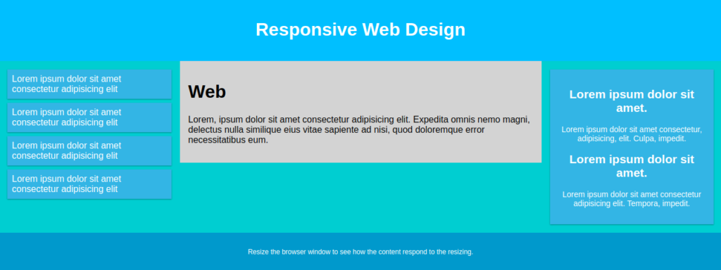
The above code should look like this Image below in your preferred browser.